Why PR Teams Need a Consistent Way to Categorise Coverage
Why PR Teams Need a Consistent Way to Categorise Coverage
By Stella Bayles·
Imagine you’ve run PR campaigns for the last year. You’ve reported on multiple campaigns and collected hundreds, maybe thousands, of pieces of coverage.
Then someone asks:
“What’s worked best for us over the last year?”
You’d think that would be an easy question to answer.But for many PR teams, it isn’t. Not because the data doesn’t exist, it’s because the data isn’t organised consistently.
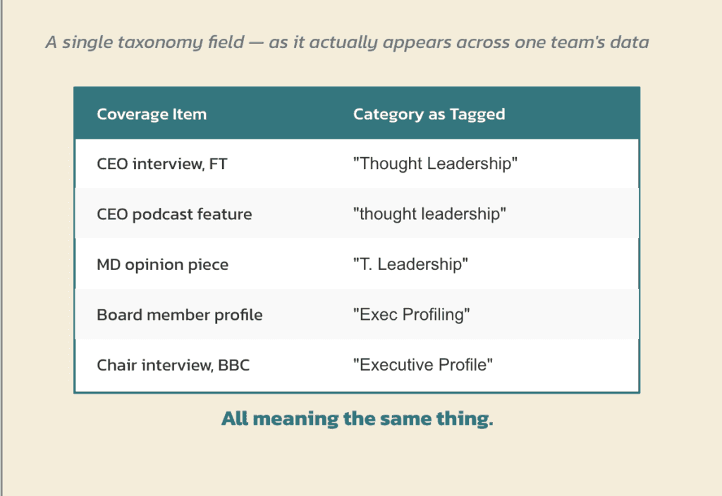
One person labels coverage as “Thought Leadership”.
Someone else calls similar coverage “Executive Profiling”.
Another uses “Opinion Piece”.
They’re all describing roughly the same thing, but when you come back later to analyse the data, meaningful comparison becomes much harder.
That’s where a fixed taxonomy comes in.
The Spreadsheet Problem
For most PR teams, this starts with a spreadsheet.
At first, it’s a simple coverage tracker; A few categories. A way to keep tabs on campaign performance.
Then the team grows, more campaigns get added, more people start updating it, more categories appear, extra columns get added.
Then before you know it, the spreadsheet has become the system.
We’ve all seen them. The tracker nobody wants to touch because changing one value could break three formulas somewhere else. The spreadsheet that only one person really understands!
“Formulas break because of inconsistency across teams i.e. there is unclear direction on the tagging process, plus tagging can be time-consuming so people put it off“
anon PR agency department lead
Our research found that 51.5% of PR professionals still use spreadsheets to track coverage performance. More than half believe their measurement system would struggle if a key team member left tomorrow.
This isn’t because teams are doing anything wrong.
It’s because organising PR data consistently is harder than it looks.
In fact, 42% of PR professionals told us that setting up a taxonomy was the most difficult part of manually tagging and tracking coverage.
What Is A Fixed Taxonomy?
Put simply, it’s a set of categories that always mean the same thing.
That might sound restrictive, but it’s actually what makes reporting, benchmarking and analysis possible.
Here’s a real example.
A customer recently asked whether they could add these options to their Editorial Format list:
Syndications
Mentions
Newsletters
At first glance, that seems perfectly reasonable.
But they’re actually describing three different things.
Mentions describes how prominent a brand is within a piece of coverage.
Newsletter describes where the coverage appeared.
Syndication describes how content was distributed.
They’re all useful pieces of information.
They just don’t belong in the same category.
If one person tags coverage as an interview, another tags a newsletter, and a third tags a mention, you’ve mixed completely different types of information together.
Over time, the data becomes difficult to compare, benchmark and learn from.
A good taxonomy keeps those concepts separate so that every category has a clear purpose.
But Every Campaign Is Different
This is usually where people push back and challenge;
“But every campaign is different.”
They’re right.
A campaign focused on awareness shouldn’t be measured in the same way as one focused on reputation, sales support, investor confidence or visibility in AI search results.
Objectives should change.
KPIs should change.
Outcomes should change.
What shouldn’t change is the structure underneath them.
We believe in:
Consistent Drivers. Flexible Outcomes.
At the foundation level, coverage should be classified using things we can directly observe and influence:
Activity
Tactic
Sentiment
Brand prominence
These are the drivers of coverage performance.
They help explain why coverage performed the way it did.
Outcome measures still matter, but they sit separately. They can and should change depending on the objective of each campaign, whether that’s reach, engagement, share of voice, sales impact, CPM or LLM visibility.
This is also why things like media tiers aren’t part of a core classification system.
Media tiers can be useful, but they’re not drivers of coverage. They’re one way of assessing the value or audience of the coverage after it’s been earned.
By keeping drivers consistent and outcomes flexible, teams can compare campaigns more effectively while still measuring success in a way that reflects each campaign’s unique goals.
Why It Matters
Most PR teams don’t struggle because they lack data.
They struggle because their data means different things to different people. Without consistency, every campaign becomes its own island.
And it’s not just campaigns. Without a shared structure, it’s difficult to compare performance across clients, teams, regions or competitor brands. Everyone may be collecting coverage, but they’re often categorising and measuring it differently.
Consistent classification creates a common point of comparison. It makes benchmarking possible, not just within a single campaign, but across an organisation and eventually across the wider industry.
You can still count coverage. You can still create reports. But answering bigger strategic questions becomes much harder:
Which activities consistently generate the strongest results?
Which tactics lead to the most prominent coverage?
What patterns are emerging over time?
What should we do more of next?
Those are the questions that turn reporting into insight.
They’re also the questions that underpin award entries, new business pitches and strategic planning. Success is much easier to demonstrate when you have a reliable framework for comparison. Without one, it’s difficult to know whether results are genuinely exceptional or simply impossible to compare fairly.
And they’re increasingly important.
Our research found that 75% of PR professionals find it difficult to lead PR strategically without structured insight, while 68% believe budget decisions without structured analysis are essentially guesswork.
Why This Matters More Than Ever
Historically, inconsistent categorisation was mostly a reporting challenge, today, it’s becoming an insight challenge.
As AI tools become more common across communications, structured data becomes increasingly valuable. AI can help identify patterns and opportunities, but only if the information underneath is organised consistently.
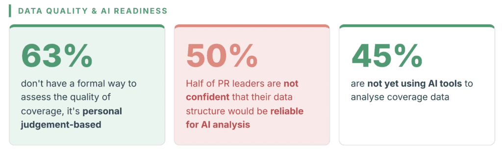
Interestingly, 50% of PR leaders told us they aren’t confident their data is reliable enough for AI analysis, while 45% aren’t yet using AI tools to analyse coverage at all.
The challenge isn’t AI or the tools, it’s the data structure underneath it.
From Reporting Coverage To Understanding It
This is one of the reasons CoverageBook is evolving beyond reporting. For years we’ve helped teams collect, organise and share coverage.
Now we’re increasingly focused on helping teams understand it.
Features like Brand Prominence help teams go beyond coverage volume and understand how central a brand was to a story.
And this year we’re continuing to invest in coverage analysis, helping PR teams uncover patterns, benchmark performance and generate stronger insights from the coverage they’re already earning.
We believe the future of measurement isn’t creating more reports. It’s learning more from the coverage you already have. And that starts with organising it in a way that makes learning possible.
If you would like to try analysing your coverage start a free trial of CoverageBook here.
Research mentioned in this blog post was carried out by CoverageBook. For more info and full results download the PR Data Report here.
Make your next coverage report in minutes
Add your coverage URLs to a free trial and let CoverageBook do the rest — visuals and credible metrics in a beautiful report, ready to share.