🎉 Feature Release
Now you can judge a book by its cover, with new stylish, flexible front cover layouts & enhancements
When your reports look good they’ll command attention, enhance credibility and stand a much better chance of being read.
That’s why we’ve been busy creating some huge front cover improvements to give you that all important first impression that sets the scene for your PR results to shine. Here’s a quick tour of what's changed:
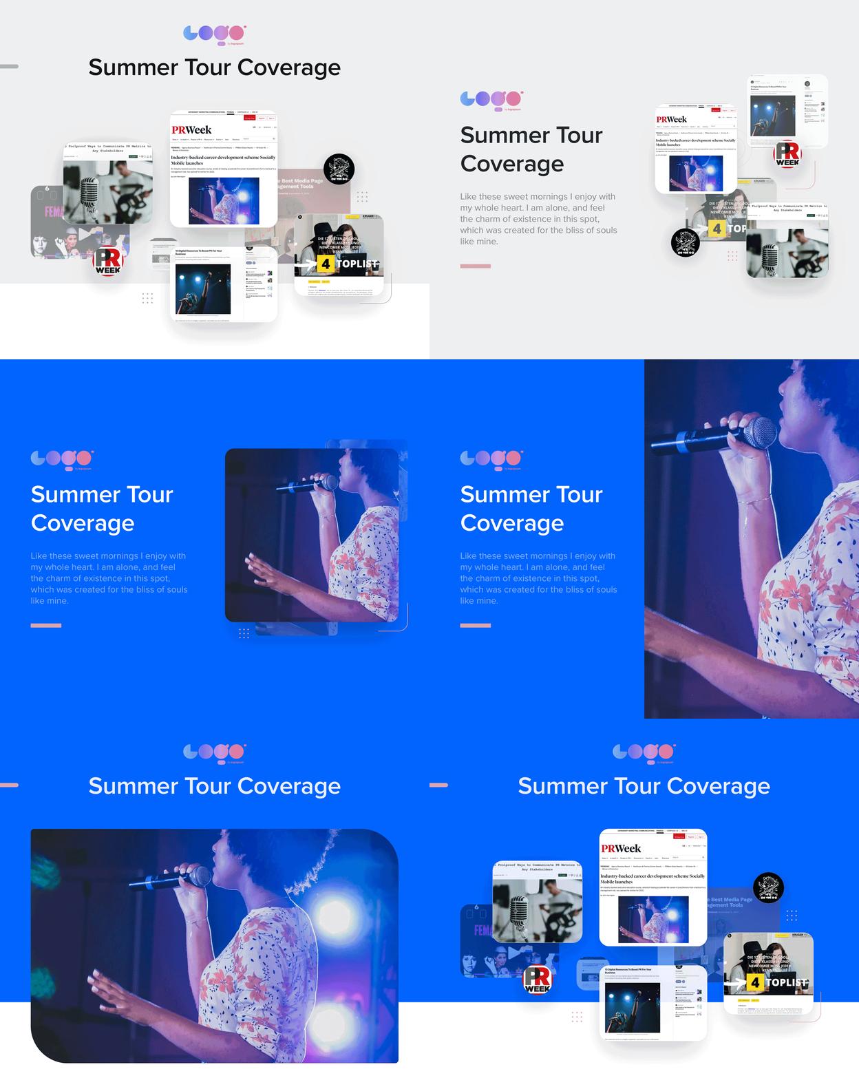
A lot of presentation and design tools have a ton of options. But we’re trying to save you time, not give you more work to do. Everything in this release can be achieved with just a couple of clicks. And with smart defaults settings it works straight out the box without having to do anything if you prefer. You still get heaps of flexibility, but without pushing pixels around for hours.
New layout options
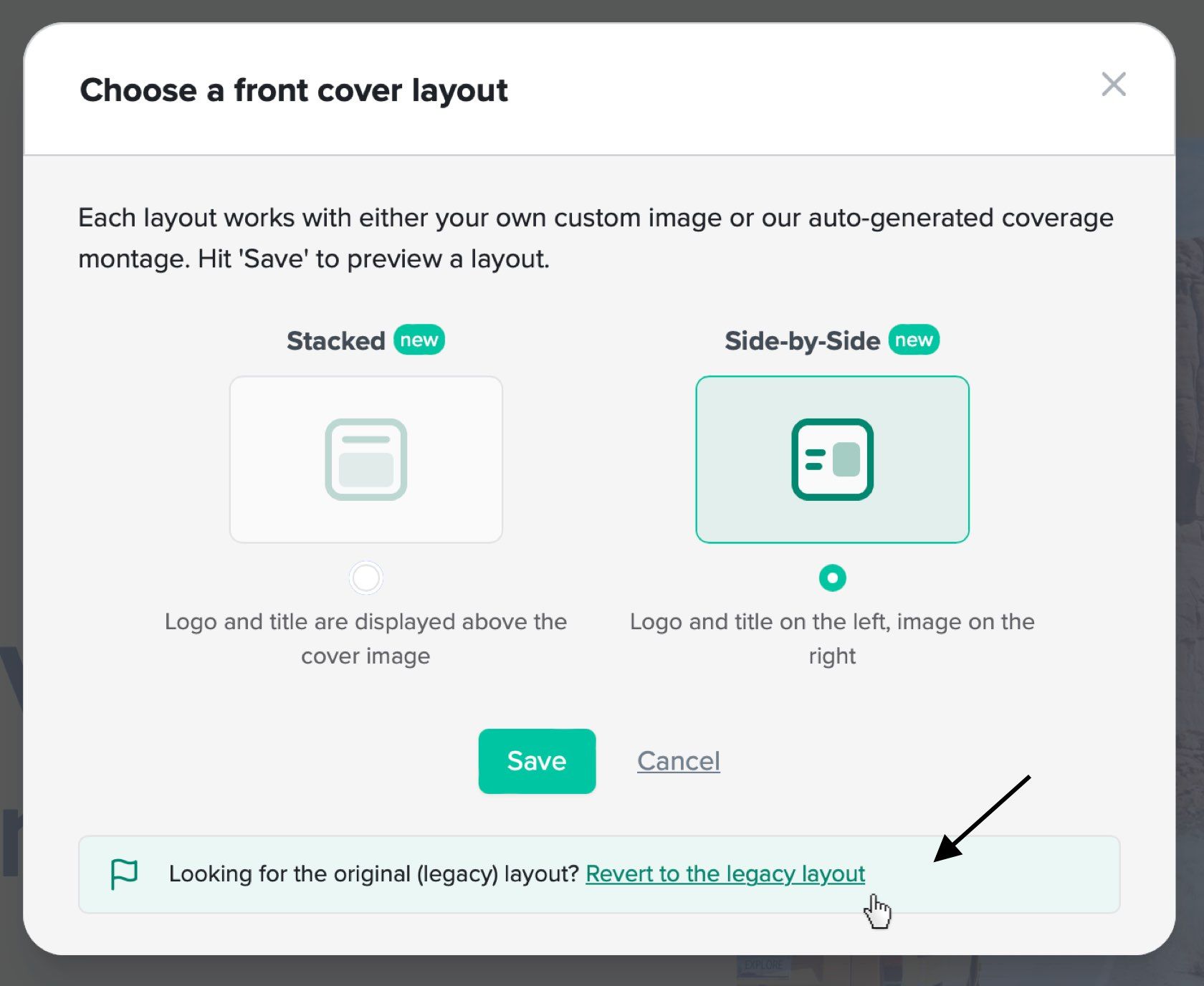
Up until now, there was just one front cover layout available. Now you can choose to have your logo/title ‘Stacked’ on top of your image, or have them ‘Side-by-side’ (p.s. Side-by-side works great if you’re exporting to PDF).
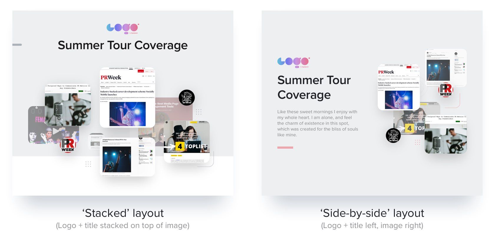
From the Front Cover edit page, simply click the ‘Layout’ button and you can instantly switch between layouts to see what works best for your report.

Custom image style & sizing
Of course all layouts work either with our auto-generated coverage montage (above) or your own custom images.
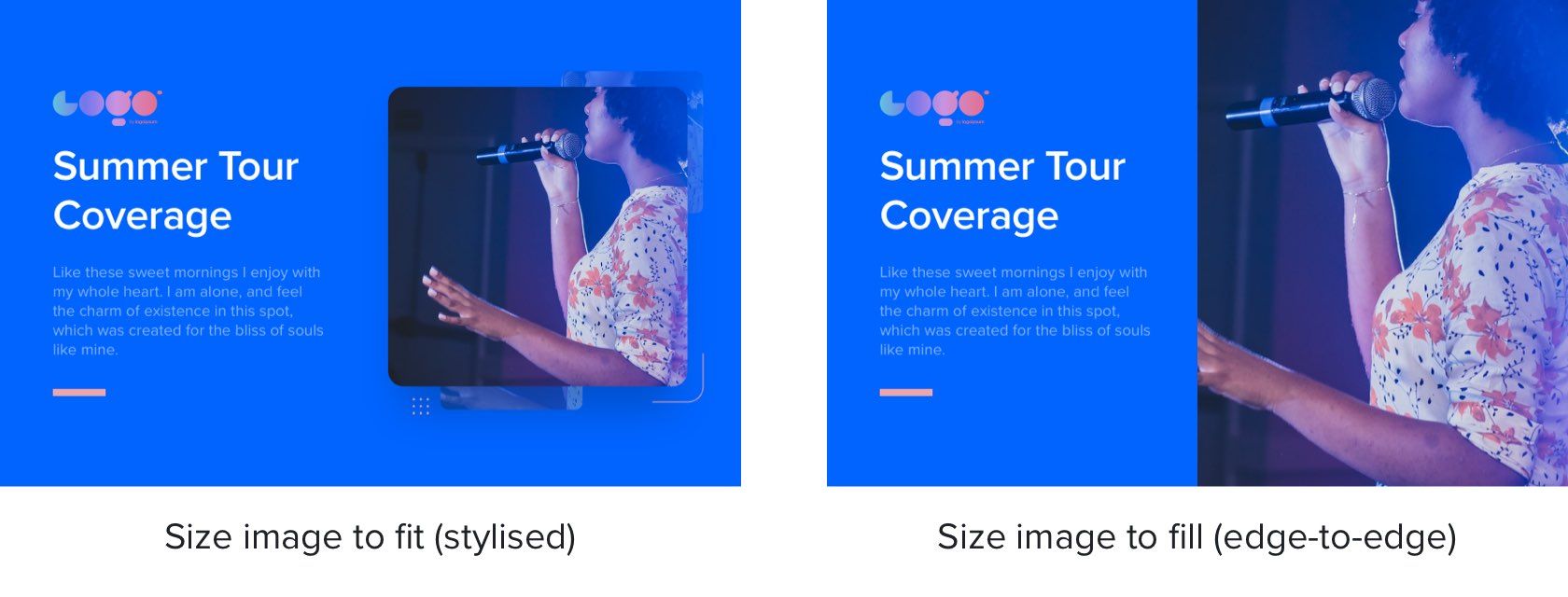
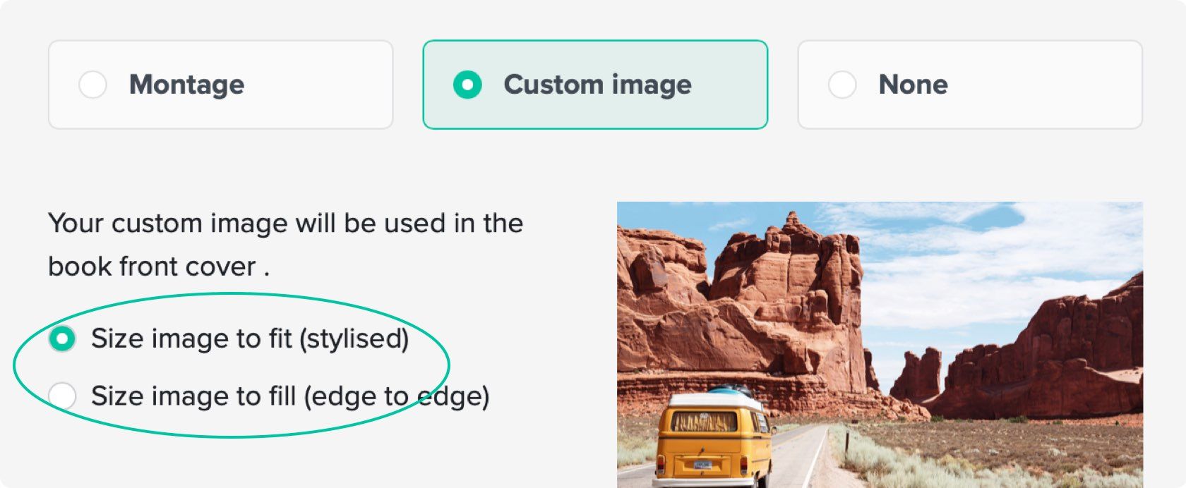
If you’re using your own cover image, to give you even more flexibility there’s a new option to size the image to fit (which has some little stylised elements of design flare) or size to fill and go to edge-to-edge within the layout.
Just click the ‘Cover image’ button, or click the image itself to bring up the editing window and choose your preferred option.
Front cover background colour
The eagle-eyed among you may have already spotted in the images above that you can now set a background colour to your front covers.

And if you don’t have your exact brand colours and hex codes there’s a handy new palette of tried and tested default colours to get you going. You can still add a separate brand accent colour as well (from the options at the top of the ‘Overview’) which will add a subtle branded feel throughout your report.

Redesigned coverage montage with control over which images are used
The automatically-generated coverage montage image has been given a refresh to make it feel more distinct from the Highlights. And it now features a couple of publication logos in addition to the screenshots.
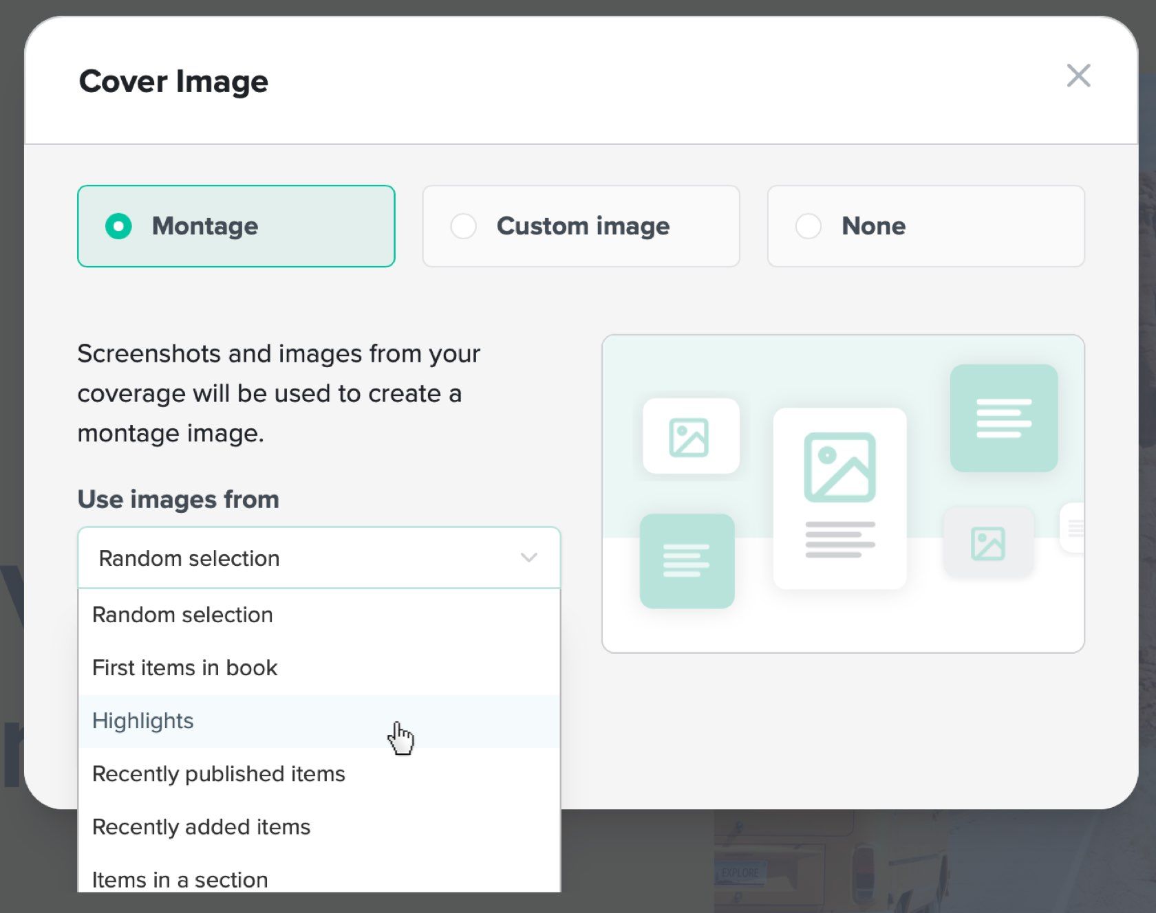
You can now pick where the montage images are sourced from. From the ‘Cover Image’ options window, select ‘Montage’ and you’ll see the option to use screenshots and images from particular sources within your report. The first items in your selection will feature in the montage.
Single page front covers in the PDF
Previously, the tile and logo block were on the first page in the PDF, and the image was on a subsequent page. Now it’s all on a single page.
The ‘Side-by-Side’ layout works particularly well for PDFs so do give that a try if that’s your primary way of sharing your reports.
What happens to existing reports?
New reports will default to the new layouts and settings. Any reports you’ve made before this update will remain unchanged.
If you’d like to update an existing report or just try out some of the new features feel free to have a play. You can revert existing reports back to the original ‘legacy’ layout easily so feel free to experiment.
We hope you enjoy the updates and we can’t wait to see how you use these new features. As always please get in touch if you have any feedback or questions. And thanks for being a CoverageBook customer :)